Safeguarding Poster
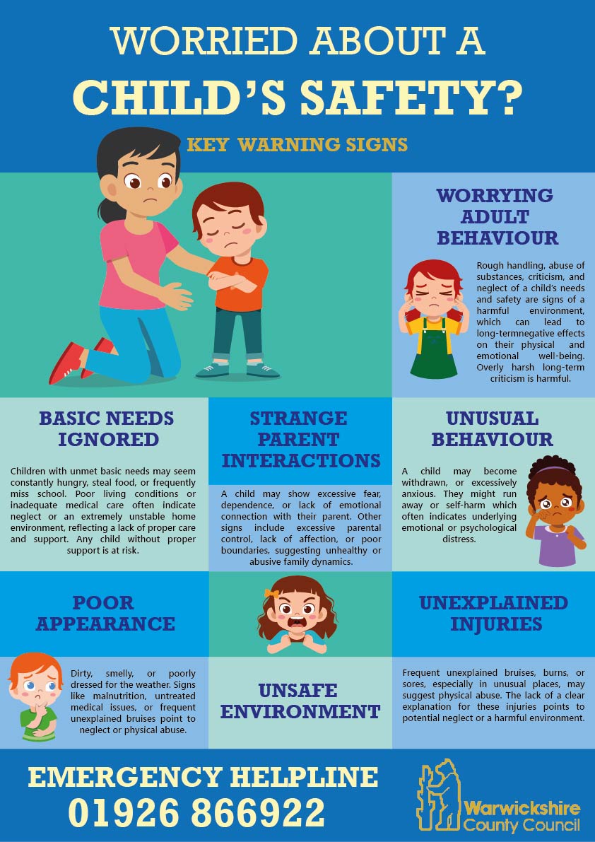
A safeguarding awareness poster redesigned to communicate complex information through a clearer, more accessible, and visually cohesive approach.
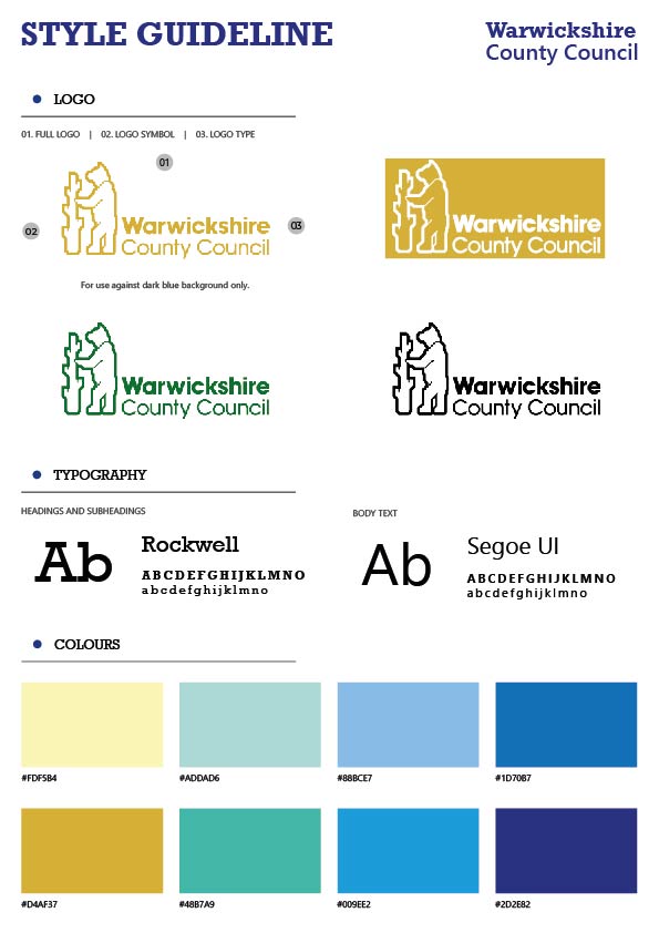
This project invovled transforming a dense information-led poster into a more engaging and approachable design through the use of welcoming grahpics structured layouts and consistent colour application. Alongside the final outcome, the project also includes an earlier design direction that was not pursued further, highlighting the iterative development process. A supporting branding guideine was created to ensure consistency across typography, colour usage, iconography and overall communication sytle.