Typography
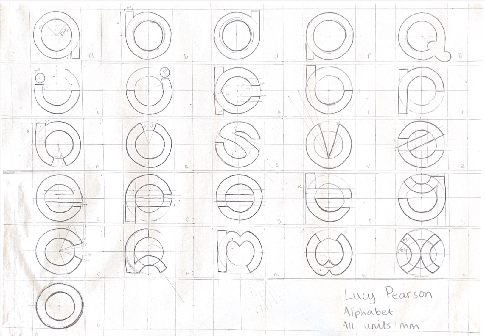
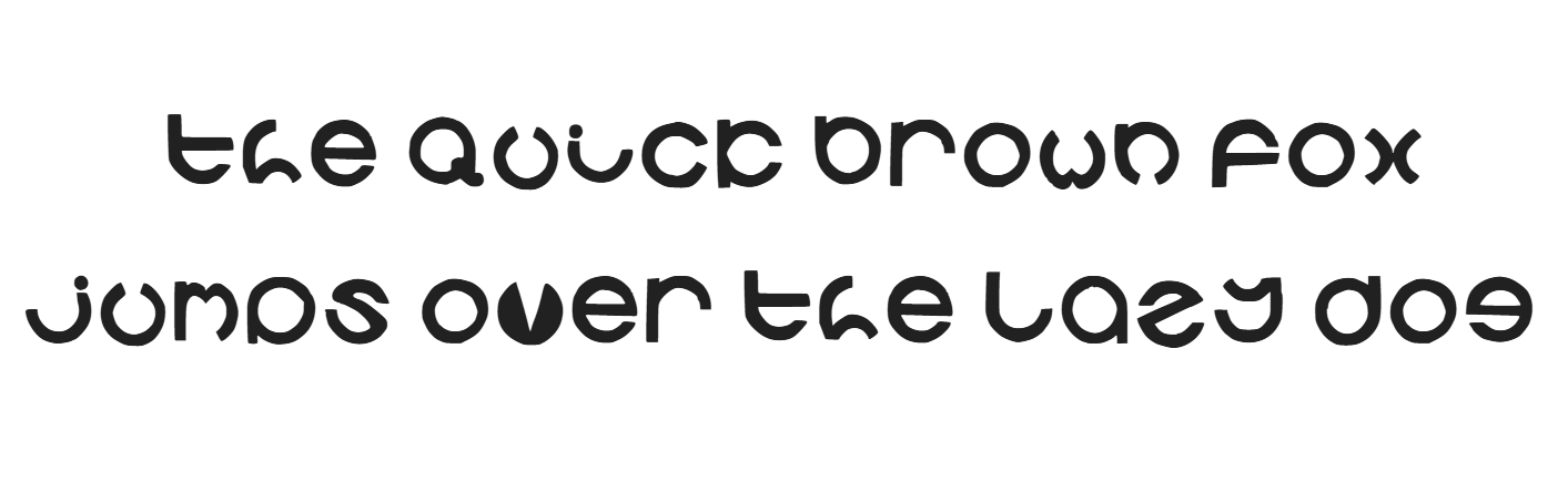
A custom lowercase alphabet design exploring geometry typography built entirely from circular forms.
This project involved designing a bespoke lowercase type system where each letterform is constructed using a consistent circular structure. The work includes the final technical drawings that establish proportion, rhythm, and construction rules, alongside a developing digital interpreation of the alphabet. The project focuses on exlporing how strict geometric constraints can still produce a functional and expressive typographic system, complete with a fully refined digital typeface.
Click into the text to add your own text:
© 2026 Lucy Pearson
Free for personal use.
Commercial use requires permission.