Crumbs
A branding exploration for a cupcake company fearuring two distinct logo directions and an identity system.
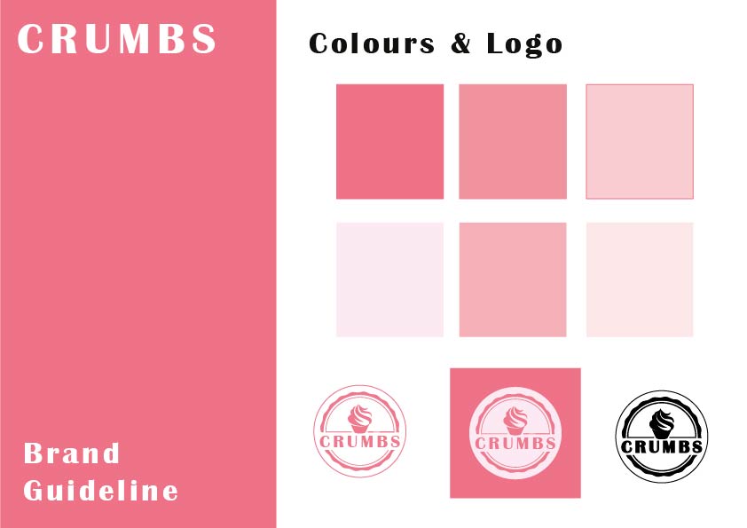
This project involved designing two contrasting logo concepts for Crumbs, each aimed at a different audience and brand personality. I developed one direction further into a partial branding guideline, including colour palette, typography, and logo application rules to create a cohesive visual idenitity. Pressenting both concepts highlights the strategic thinking behind the branding process and how design choices can shape audience perception.